Design principles and what you need to know
1. Balance

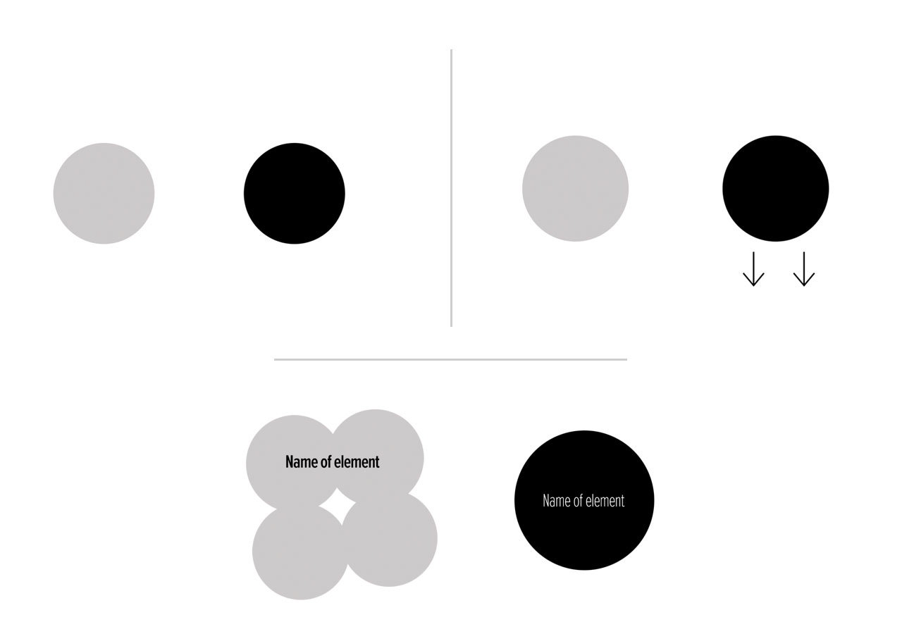
In the top row, we see how the darker circle pulls the right-hand side down. We want our elements to be balanced on the page or design. The bottom example shows how that balance is shifted by using a larger mass and an emphasised weight of the typeface.
2. Alignment

3. Proportion
How do you size elements?

Whilst the new logo on the right-hand side utilises the golden ratio, is a big improvement. It's not solely because of the Golden Ratio that makes it more aesthetically pleasing. When it comes to proportion a good eye, is a better skill to have than memorising the golden ratio.
White Space
White space is the most important design principle as many of the other principles can be influenced by it. Alignment, balance, emphasis and hierarchy are all affected by the white space given. If there is one design principle to improve on, make it white space.
White space doesn't mean the surrounding area of space has to be white. In fact, white space can be ANY colour.
The quickest win for any website is to increase the line-height of your paragraphs to a value between 1.4 and 1.6.
Unity
Unity is how all your different elements and principles come together as one. The sum of all the parts is more important than the parts themselves.
Your fancy animated navigation looks ‘cool’ but does it tie into that single message you are trying to portray?
Does every single added image fit into the look and feel of the other images? Is there a feeling of consistency?
A single unified message and all your elements buying into that will bring you better communication for your website and marketing. Better communication brings more bottom-line success.
Tottta - The One Thing To Take Away
Whilst knowing these design principles and techniques can be beneficial, it doesn't mean that you will become a good designer solely because of that. It's useful to know them but practising design in where you intuitively pick up the skills. If there is one principle to learn from it's white space.


