Solving the problem of not enough design emphasis on websites
Enough of the theory, let's crack on with some design elements!
If you haven't watched the previous 5 episodes I highly recommend that you do. Each video builds upon each one in the series.
How to get attention in your websites
- You can use a mix of these 6 together
- You generally don’t want to use all 6 together, but some overlap
- As you become aware of these, you will realise that subtly does it!
- One technique that must be taken extremely carefully
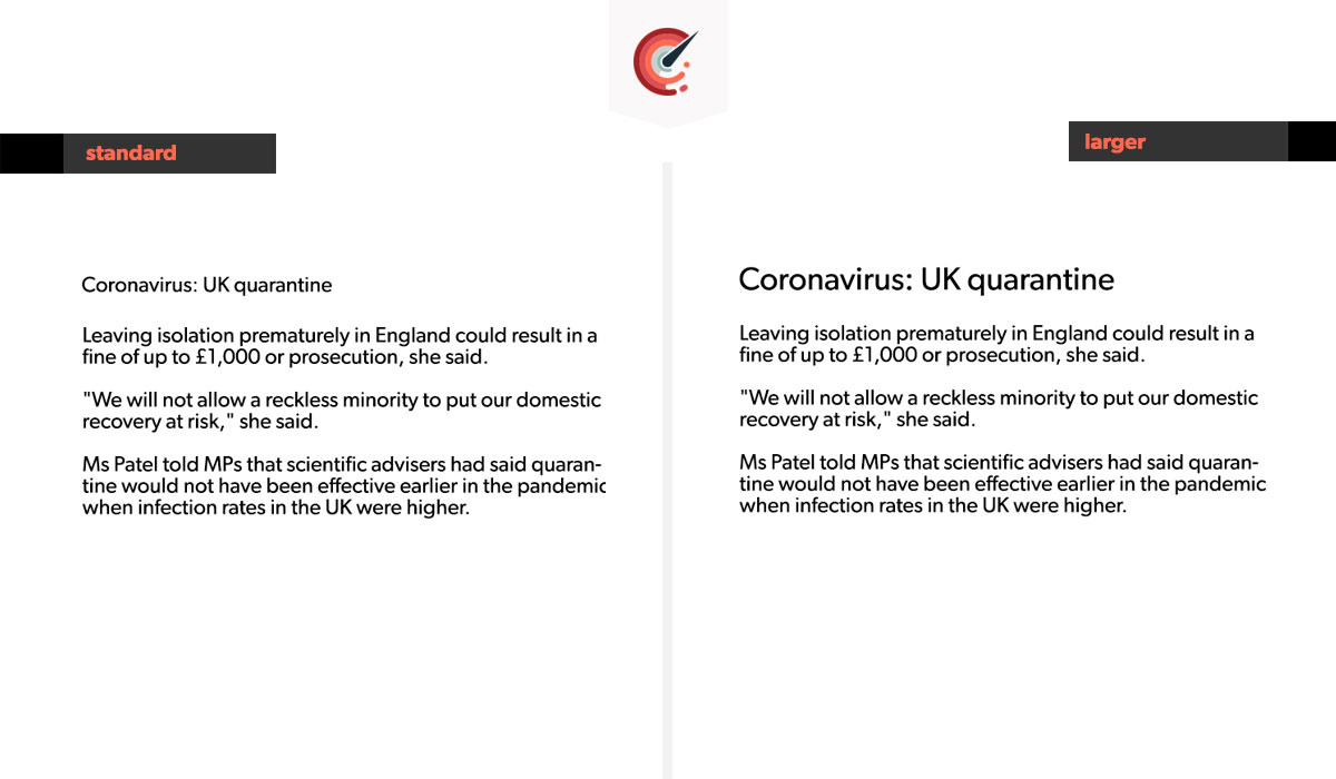
1.) Sizing
2.) Contrast
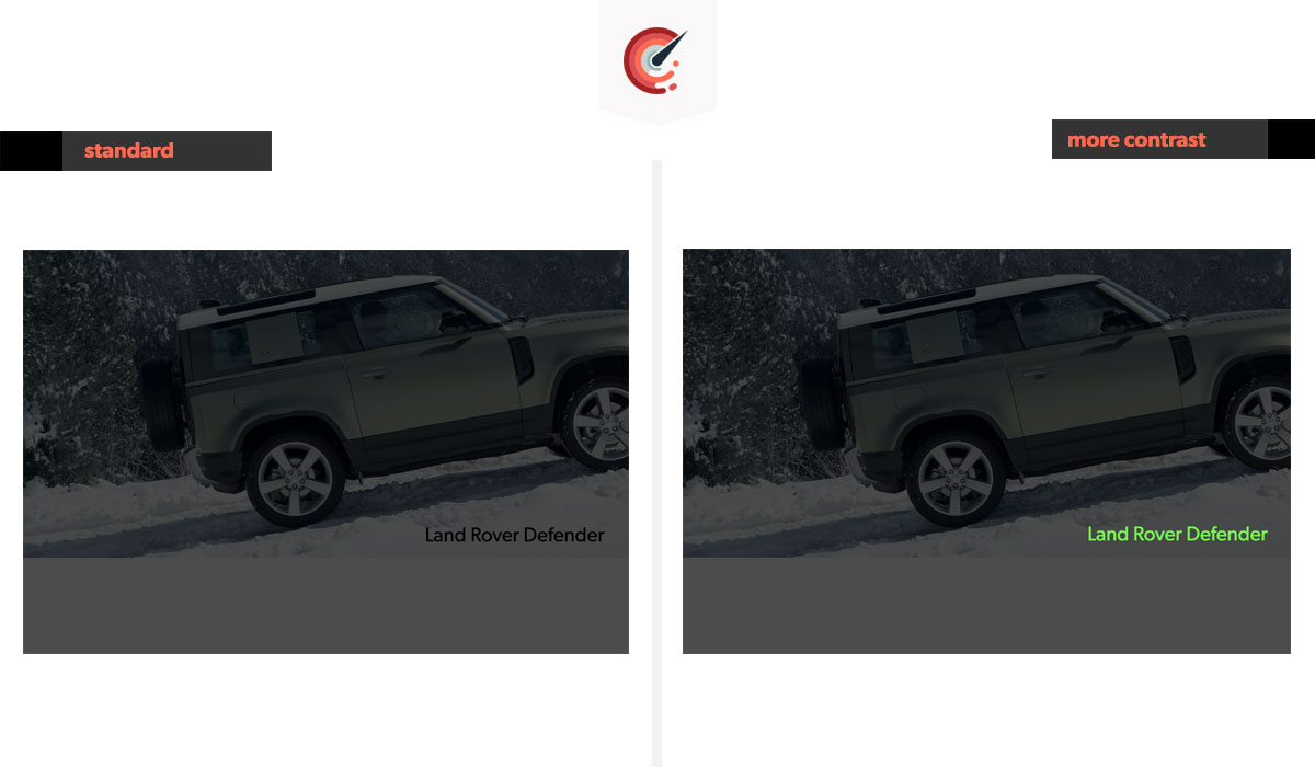
The contrast above is increased by changing the colour of the text to a garish green. This gives it much more attention. When dealing with colour, sometimes the contrast works together. P.s The design above isn't going to win any awards, just for reiterating the point
3.) Typeface
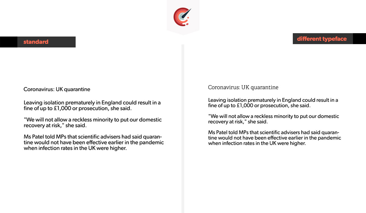
There are approximately 100,000 typefaces out there, many are awful, but it makes for an unlimited choice.
You can also change the weight, the style and the boldness for even more emphasis.
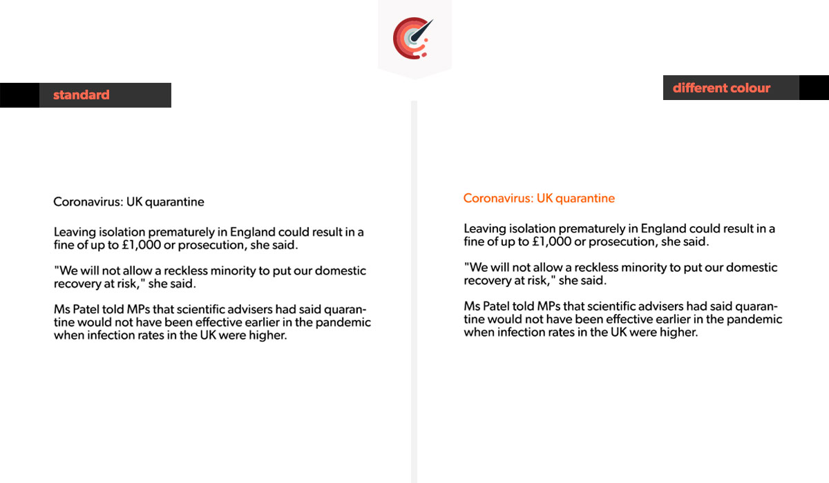
4.) Colour
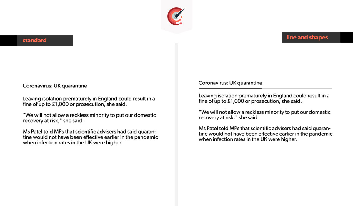
5.) Line and shape
6.) Animation
Be very careful when using animation. By giving lots of movement you can destroy pages. This is because a lot of adverts are animated. If you make your element anything like an ad, people will almost subconsciously ignore that element knowing it to be an ad. So by making it look very important, you are giving the opposite effect! See the video above for the animation that looks like an ad.
Summary
There are many ways to give attention and emphasis to elements.
Next week I cover a further 5 design principles for even better-performing design.

