Series Finale - Helping You Build Better Websites
In this series we have come a long way.
In episode 1 we saw how people really use websites. That being, people are busy and distracted and just want to get on with thier next task and then get on with their day.

In episode 2, I set out why we should as web designers can learn a lot from newspapers and billboards. People view billboards very quickly. Just imagining seeing a billboard on the motorway, you don't have long to get your message across. Think when in the supermarket aisle, you don't have time to read the small print.
Mobile-first forces us to prioritise. There is only very limited screen real estate, and this constraint makes for good things. When we then consider the desktop design, does everything that we left out on mobile need to be left out on desktop? Cleaner solutions win in many of these situations.
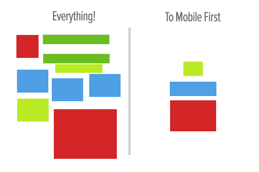
Tottta was covered in episode 4. Rather than adding everything, we focus down and answer the question of what is the One Thing To Take Away (Tottta)? Many sites and businesses try and cram everything in, it rarely works. Have a single focused message is a much better alternative. When we try and add everything, in reality, we find that nothing is taken away.
Design Principles
Design principles are good to know. They can help. However, just because you know every design principle and every equation DOESN'T mean you will be able to create a successful design. More importantly than knowing each design principle well, is building more websites and getting actual experience.


Look at how many messages the above 2 designs are trying to get across. One. This is how it's done.
That concludes the first series. Hope you took something away.

