
Should i use a carousel?
Carousels are the all the rage but are they ruining your website?
There is a website (ShouldIUseACarousel.com) which has got a lot of attention, is it right however in its assumption that you should never use a carousel / image slider?
Exploring the problem of carousels
- Users often see them as advertising and they can be missed very easily
- They are distracting when reading other content
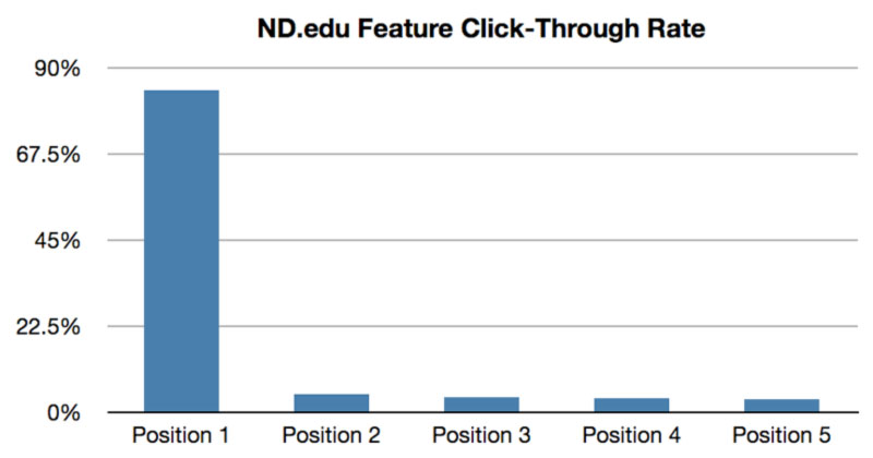
- In one test Only 1% clicked a feature and 89% of that was in the first position - why not have a single hero image????
- Burden of seeing it’s a carousel and then learning it
- They add to file size - the javascript, css and extra images increases page load time
- Accessibility issues - users using only a keyboard
- Dilute the main message given and can hide the story and important information
- People read at different speeds
Why use them in the first place?
- The benefit is that you can fit in a lot of information in a small space
- Designers think they are cool (aaarrrrrhhhhh)
- They are often a compromise of bickering organisations are departments who often want to the on the home page/ Remember what we said said earlier - 89% click on the first one
Bad use of a carousel / image slider
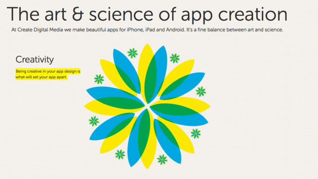
The website Created M is a bad example of slider usage. It has auto scroll on, has no navigation, no context in what or how many slides there are. It's distracting and useless.
When to use a carousel?
- Showing off portfolio content - the user knows what to expect and a task is looking through the content
- Photography / Real Estate - makes viewing easy and the images are related
- Want users to grab a very important second message. This message must also be repeated on the site and not just in the carousel
- Weather application - they expect the next days weather to show
Alternatives to Carousels?
Have no carousel and just use a single hero image. In 23 and Me they use a strong image, headline and call to action efficiently. No need for a fancy carousel.

The great thing about NOT using a carousel is Focus.
Ben Sherman

It would have been so easy for them to have a slider - but it’s all about focus and no distraction - my kind of design - effective and purposeful!
Alternatives to Carousels?
Make it smaller, most of the drawbacks occur but they can be clearer, present information well and still save space.
If you must use a carousel
- Make navigation very clear, large with a thumbnail and text - giving user context and control
- Never have core content in a carousel - articles - crucial pieces of information
- If you absolutely must auto scroll it - 3 words per second
- Minimal amounts of text
- No more than 5 slides. Make absolutely sure every slide has earned it’s place to be there
- Pause on hover
- Don’t have contrasting Call To Actions - they must relate
- Think if it hinders your site - if in doubt remove. - Test it

Rec Sports Looks integrated into site, Strong navigation, thumbnails + text, clear Call To Actions, no auto scroll and is a good example of a carousel if you must use one.
Back to the original question, Should i use a carousel?
In most instances - No, but like most things it depends.
You must however understand there drawbacks and prove they work.

