Things you must consider first before diving into PhotoShop
Before you dive into the design of a website there are things you must consider prior to jumping into PhotoShop!
Much to do first:
- Client goals, targets, aims, interviews
- Competitors
- User research
- Personas
- User competitor testing - (if you have the budget)
- Analysis / design research
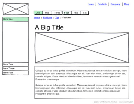
- Wireframes
Plan, plan, plan!
It's so important to plan. Jumping into a design package and start “designing” is irresponsible. Good design starts way before PhotoShop. It can mean the difference between success and failure of your project. You really not open a design package before you do some good research and produce the documentation in the above list. Personas are possibly the most effective way of getting in a users mind and they are hugely helpful. Wireframes are a must too, without wireframes there could be huge confusion within the team and or client in what is actually involved with the site.
Mobile First
What is the most important things on the page? It's that question that i love Mobile First for. This intense focus really helps you design what's on the page. What can you exclude? If you are excluding on mobile then it’s likely you can exclude on desktop too Just about all markets should consider mobile first. If you don’t have a high usage on mobile, it’s almost a certainty you will in the future. Check your web stats to see what traffic you have, in the popular Google Analytics there is a clearly defined Mobile section in which will give you detailed statistics to what your current traffic is. A big tip here would be put the date back as far as you can and see how much it is rising.
The home page

People are unlikely to come to your site to use the home page, they will use it as stepping stone to find what they are looking for. Sure there may be some feature on some sites that most users on that particular site use, but its not the norm. Most sites internal pages are where most of the interaction, reading and buying is done.
The home page is normally the page us designers start designing with.
However:
- The inner pages will get a lot more traffic than the home page
- The inner pages are where most interaction is done
- The inner pages are where most selling is done
- Your home page is important but it's not the be all and end all!
Focusing on inner pages allows us to
- Allows you to focus on call to actions - hugely important parts of the site
- An style guide approach in which you focus on elements first then build up the pages from those elements
- Typography where the majority of people will view your site isn’t an after thought
- Gets you to think really strongly about the users journey throughout the site
- From there work up the ladder - to a category and then maybe onto the home page
Consider designing in the browser from the off
It’s not for me because it restricts creativity and speed of creation of design elements but it’s an option
As the other video eluded too - start with PhotoShop then go into the browsers when you are happy with the look and feel. This gives us the best of both worlds, with the creativity of PhotoShop and the scalability of designing in the browser.
So in summary
- Think mobile first - what’s really important?
- Don’t design the home page first!
- Consider designing in the browser


