So You Think You Know Everything About The Simple Hyperlink?
On the face of it, the link, that very straight forward <a href="www.domain.com">< Link /a>
Looks incredible simple to get right but there are some experienced web teams that make very basic mistakes.
- The link is what glues the web together
- Imagine a web without links for a second - not a pleasant place
- Without links the web would be a very different world
- Links are so easy to implement that they are often overlooked by designers and site owners
- Anyone, even without web experience can use the hyperlink with under 15 minutes of training. However it’s not as easy as it looks!
Make links look clickable
- Links need to stand out and say “Hey I’m a link click me”
- This is a big issue with accessibility as we will see
A good way to see if your links are clickable is to take the colour out and blur the design and see if they then stand out.
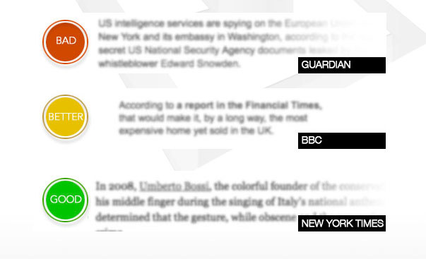
So... Underline links within content
But never ever underline content that is not a link. It will look clickable, although isn’t and will disrupt the confidence of the site with your users.
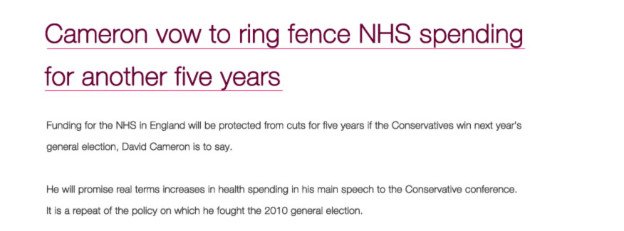
Use border-bottom instead of text-decoration
Extra tip if you leave out the colour of the border then it will inherit from the colour of the text - making updating easier
So:
a{ color:#f00; border-bottom:1px solid}Sometimes i like to make the colour different, lighter grey.
The main thing is though that an underline is there and not so so much what colour the underline is. It must stand out however and be apparent that it is an underline with sufficient contrast. Remember the golden rule, underlined text is seen as a link on the web.
Increase the length of links
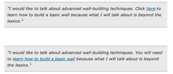
- Good description what they are clicking on - better for SEO
- Easier to click. Imagine tapping the top “here” on a mobile device
- 7-12 words are optimal, so says Jarod Spool - User Experience expert at UIE, the pioneering UX agency
Be consistent
Don’t use different words and phrases for the same links
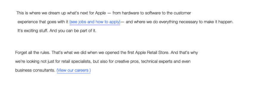
Think carefully about your links, just like you should think carefully about every part of your website project.
If a visitor clicks on a link titled Dogs Grooming they are very likely to click the back button of they come across a page that doesn’t talk about dog grooming or similar content.
Your links and page titles should be identical or match very closely.
The first thing a visitor looks for will be the page title - to confirm they are at the right destination. If not they are out of there and will likely hit the back button.
Too many experiences like this on your site and they will be off. Even 1 mistake like this by you can cause a higher exit rate for that page. That's naturally something you want to keep as low as possible. By being consistent you give visitors what they expect to see, unexpected happenings on the web make for a bad user experience.
Don’t put links beside each other
Hard to tell that they are different links. Harder on mobile because of the small click area.
Solution - to list in bullet points or put more standard text around each link. This will make the links more readable and stand our from each other.
So navigation links need to be underlined too?
No they don’t as it looks like navigation with the healthy amount of spacing around the navigation areas.
It looks like navigation, they look like links - very different from embedded links within content.

