Don’t make these web typography mistakes - make your content easier to read and more legible
People come on your website to read the content - NOT study your pretty colour scheme or drool over illustrations. You therefore better make sure the reading experience is great! Your aim for every site is to make your content legible and readable.
95% of the information on the web is written language. It is only logical to say that a web designer should get good training in the main discipline of shaping written information, in other words: Typography.
Written in 2006 but still very much holds true today.
1.) Leading (Line Height in CSS)
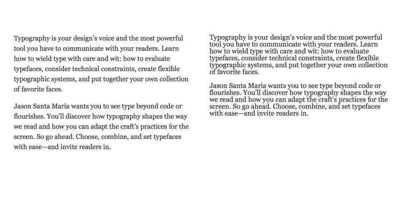
Type is very easily made more readable by simply adding more leading or line height as it's known in CSS. In the examples below you can see a clear difference in the legibility of the type.
2.) Contrast
The most contrast that is possible is white text on a black ground or black text on a white background.
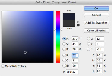
Black text on a white background is too much contrast and is actually harder to read according to some studies.
Try having a dark grey.
My own little twist to that is add in a very slight colour variation with brand colours. Hardly noticeable but is a nice little touch to any design. Mark Boulton, a famous UK designer, said "you should never have just grey in your colour selection."
3. Typeface
There are literally thousands of type faces available.
Jason Santa Maria’s advice is to learn a few and know them well
When choosing a typeface the absolute first question is - Can i read this well and is it legible. That question comes way before nonsense like “Is it pretty?” “Does it suit our style?” Functionality comes before form every time.
My personal favourite web fonts are Adelle, Jubilat, Museo all from Typekit.
4.) Not enough space - cramped
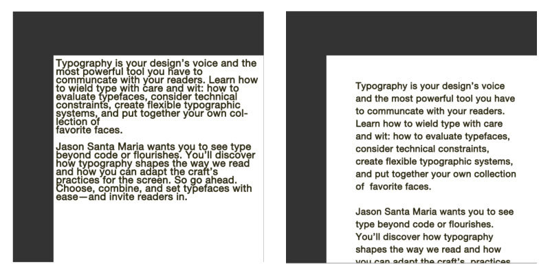
Many designs i see don't have enough padding or margin between the outer box and the main content. By adding padding and line-height in the example below makes for a much better reading experience. In the example i've added a margin and some line-height. Just with these very easily added CSS properties makes the text more legible and readable.
5.) General sizing
Designers like things to small, minimal and beautiful. Coming long before that though is if the typeface is large enough. In most situations it's not. It's a common trend these days to have large body copy and i hope it isn't a trend and is here to stay. Large body copy makes things easier to read. Having a type size like 24 pixels tall is not that uncommon. It's great to see these lovely web fonts being shown off in large type sizes. It's of course not just do do with making it beautiful but legible and readable. These large types adhere to these common type rules.
6.) How many character per line?
There are contradicting studies on how many characters but i wouldn't have any more than 100 characters. That would be at the very most, 50-70 seems ideal for most sites. You can easily set how long the maximum line is by using max-width. Something like this would
p {max-width:1400px} would say that the paragraph should be no more than 1400px wide.
7.) Justified text?
You may, just may, get away with justified text on body copy, it's very much like centring. I would never use justified type on body copy however. It's really hard to read and is bad practice. Do your sites visitors a favour and never used justified text on your websites.
Pro Tip
Some custom fonts may have a harsh edge to them. This can be fixed in most cases by using either a specific property to webkit browsers.
h1{ -webkit-font-smoothing: antialiased;}Or using:
h1 { text-shadow:0 0 1px transparent;}Remember you can use multiple text-shadow assignments by simply using a comma.
h1 { text-shadow:1px 1px 1px #f5f5f5, 0 0 1px transparent;}
