Vastly improve your Call To Actions and your bottom line
By simply changing the Call to Action on some sites you can raise conversion by over 200%
If you are a 100k a year business - that’s making it a 200k business almost overnight
TEST, test, TEST
- Test your assumptions...
- Do heavy research into your customers and potential customers..
- The only way to really see if you are making improvements to the bottom line of your business is to test
- “Testing is the truth” Dr Karl Blanks
1.) The Right Business Model?
In some businesses it’s a little more complex than changing the button text...
For instance having a free trial of your product over a strictly high ticket offer may make your businesses uptake in customers overnight.
Anywhere from 1-10% of freemium customers can become paying customers. It’s a numbers game...
There are also other business models and income streams to accommodate a freemium model such as advertising and related products.
2.) Quality
You need to follow through with your claims.
If you are selling a high quality product that falls to pieces within weeks then your business will fail long term.
You need to have quality service and product to back up your initial claims - vital to any business.
3.) Make it about me
- What is the benefit of your service?
- What do people get out of your product and of no other?

4.) Nullify the objection
- Why won’t people click that call to action?
- What is their main objection?
- Email address probably 2 things - getting multiple emails and getting that email address sold to another list - SPAM
- Stating no spam and we value your privacy can help greatly

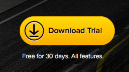
- GitTower - great version control system.
- One of the main objections is that the trial would be light on features.
- They clearly state near the call to action that all features are available in the trial.
5.) Focus
Having more than 1 call to action is ok.. Having 15 and you probably want to revisit your business goals and website model...
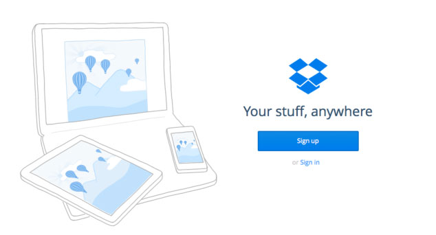
DropBox is a very popular file sync'n service. They have very little on their home page but 2 call to actions. One is sign up and the other is sign in. Sign up is the lot more prominent of the two.
6.) The Fold..
In most cases you want to place the call to action above the fold but for a more complex purchase the opposite is true.
In a fascinating split test placing the call to action below the content and way below the fold (on an average screen) gathered a 304% better conversion rate.
This was because it was a more complex purchase with multiple considerations.
Generally you want to place the call to action above the fold or in a high position on the page.
7.) Size and colour
Colour can make a difference. Don’t rule out red - although it stands for stop.
The main things to note:
- It stands out - good use of contrast
- It looks clickable
- It’s of reasonable size - too big can hurt!
One piece of the puzzle
Call to actions are just one piece of the puzzle.
Headlines, imagery, design, navigation and numerous other design and web elements are vital to turn your or your clients business into a more successful operation.
The one thing to take away (Tottta)
Do research and test your assumptions.
Today we are cheating and there are two main things to take away from the video...
2.) Ask why people would not sign up and counter that argument and make sure that is stated near or on the call to action.


